Why I Keep Reaching for the USA Flat Map Area Rug by Springland
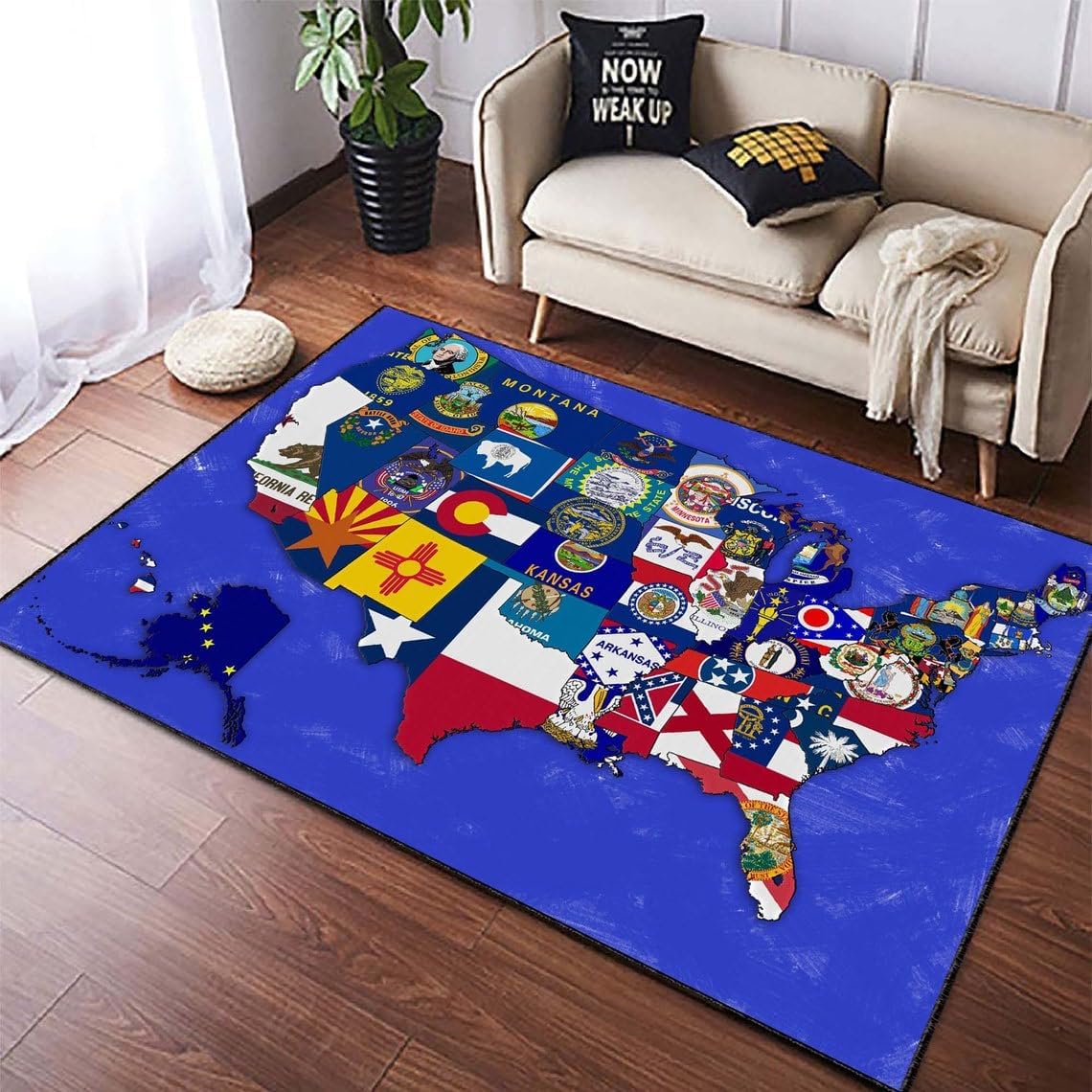
The flat design reads clean from across a room — state lines crisp, palette restrained. This earned its place on the floor without shouting for attention.
There is a particular kind of room object that does two jobs at once — it covers the floor and it starts a conversation. Maps have always worked this way. Pin one to a wall and people drift toward it. Put one underfoot and the whole room takes on a different register, something between functional and curious.
The united states of america rug category has grown quietly over the past few years. Geography-as-décor is not new — antique cartography prints have been a staple of reading rooms for decades — but the move to floor-level is relatively recent. Flat design aesthetics helped. Once the visual language of apps and infographics filtered into home goods, the USA map became a natural candidate for the treatment: clean lines, blocked states, no topographic noise.
What makes a map rug work in a real room is restraint. The temptation is to saturate — to make every state a different bold color, to add text at every scale, to turn the whole thing into a geography lesson. The rugs that actually live well are the ones that treat the map as a quiet graphic, a shape rather than a shout. Muted tones. Legible but not loud.
For a child's room, the logic is obvious. Geography absorbed through daily proximity, through the habit of walking across it barefoot in the morning. But these rugs sit just as naturally in a study, a mudroom, or a lower-level den. The graphic is adult enough to carry weight in a considered space.
One practical note for anyone measuring up: the size you think you want is usually one step smaller than the size you actually need. A rug that floats in a room reads as an afterthought. Anchor the furniture legs on it, or at least the front two. The map needs ground to stand on.